
Earth tone colors are widely used in interiors because they bring a sense of nature indoors through colors inspired by soil, wood, stone, sand, and plants.
The palette is much more diverse than just brown, ranging from beige, tan, taupe, terracotta, olive, sage, to stone gray.
By understanding the character of each color and how to combine them, you can create an interior that feels warm and natural without making the room look monotonous. Read on to find out more.
Earth tones are not one specific color, but rather a combination of colors inspired by various elements of nature. Since the spectrum is quite broad, you can choose from a variety of shades depending on the atmosphere you want to create.
What are earth tones and which colors are included?
Earth tones are a group of colors inspired by natural elements such as soil, sand, wood, rocks, clay, and foliage.
Since their sources of inspiration are diverse, this palette is not limited to brown. Beige, cream, tan, taupe, olive, sage, terracotta, and stone gray can also be used to create an earth-inspired color scheme.
What brings these colors together is their tendency to appear soft, slightly muted, or natural. As a result, colors that may actually be quite different can still feel harmonious when placed together in one room.
In an interior, you do not need to use all of these colors at once. Two to four colors that share a visual connection are usually enough to create a palette that feels consistent.
Different earth tone colors and the character they bring

1. Beige and cream for a light base
Beige and cream are easy choices for large areas such as walls, sofas, curtains, or rugs. Both have a light appearance, making them suitable if you want to maintain a light and airy feel in the room.
You can pair them with medium-toned wooden furniture, brown decorations, or green accents. For rooms with limited natural light, choose a beige that is not too dark so the overall composition does not feel heavy.
2. Brown and tan for added warmth
Brown is one of the colors most easily associated with soil and wood. Its spectrum can range from relatively light tan to dark brown with a stronger visual character.
Introduce brown through wooden tables, furniture frames, baskets, cushions, or decorative elements. If your larger pieces of furniture are already dark brown, you can balance them with cream or beige walls.
3. Taupe for a deeper neutral look
Taupe sits between brown and gray, making it suitable if you enjoy neutral interiors but do not want the room to be dominated by white or cream. This shade can be used on textiles, sofas, rugs, or accent walls.
Pair taupe with light wood for a lighter atmosphere, or use small amounts of dark brown and black if you want to create stronger visual definition.
4. Olive and sage for a natural touch of green
Green can also be part of an earth-inspired palette, particularly olive and sage. Olive has a deeper character, while sage tends to be softer with slightly gray undertones.
For a bedroom or relaxation area, you can use sage alongside beige and warm white. Meanwhile, olive can be introduced as an accent on chairs, cushions, curtains, or decorations to give the room more character.
Read also: Using sage green in a minimalist interior
5. Terracotta and rust for warm accents
Terracotta takes its inspiration from the color of clay and typically combines brown, red, and orange. It has a relatively strong presence, so you do not need to use it across large surfaces.
You can introduce it through a single chair, sofa cushion, vase, decorative artwork, or plant pot. Pair it with cream, beige, natural wood, or olive to keep the composition balanced.
6. Stone gray for a modern feel
Not every earth-inspired color needs to feel warm. Stone gray can bring a calmer, more modern quality to the palette.
If a room is dominated by too much gray, add wood, rattan, or beige textiles to soften the cool impression. This approach works well if you enjoy modern interiors while still wanting to maintain a visual connection with natural materials.
Easy-to-apply earth tone color combinations
You can start with one base color, one complementary color, and one accent color. As an initial reference, the 60–30–10 proportion principle can help you visualize how the colors are distributed.
Around 60% can be used for the dominant color, 30% for the secondary color, and 10% for accents. These numbers are not strict rules, so adjust them according to the shape of the room and the furniture you already have. Some combinations you can try include:
-
Beige + wood brown + olive for a natural feel
-
Cream + terracotta + light brown for a warm atmosphere
-
Sage + beige + warm white for a light look
-
Taupe + dark brown + black accents for a bolder character
-
Stone gray + beige + wood for a modern interior with a natural feel
If you are just starting to change the look of your room, introduce stronger colors through smaller decorative pieces first. This way, you can adjust the composition without having to replace your main furniture.
How to use earth tones according to the room

1. For the living room
A living room usually has several large surfaces at once, from walls and sofas to rugs and curtains. For this reason, choose one element as your starting point.
If your sofa is beige, for example, add a table or shelving unit with a wood look, then introduce olive or terracotta as accents through cushions and decorations.
Avoid making every element the same shade of brown, as this can make the room appear flat.
Add texture to create variety without having to introduce too many colors. Rattan, wood, textured textiles, and ceramics can add depth to a relatively simple color scheme.
2. For the bedroom
In the bedroom, lighter colors such as cream, beige, sage, or taupe can be used across larger surfaces. Darker shades can be introduced through blankets, bedside tables, frames, or decorations.
Consider the lighting as well. Beige that appears light during the day can look warmer at night under artificial lighting.
For this reason, observe how your color combination looks under different lighting conditions before deciding on the main composition.
3. For the kitchen and dining area
Terracotta, wood, olive, and cream can be used to create a welcoming atmosphere in the dining area. You do not have to replace the cabinets to introduce this palette into the room.
Try starting with tableware, vases, chairs, lampshades, or table textiles. This approach also makes it easier to change the accents whenever you want to refresh the look of the room.
4. For small rooms
If your space is limited, use lighter earth tones as the dominant colors. Beige, cream, or light taupe can help maintain a light appearance, especially when natural light is available.
Deeper shades such as olive, dark brown, or terracotta can be used on smaller elements. For example, choose a cushion, vase, chair, or decorative area as a focal point.
Read also: How to choose colors and patterns that can help make a room feel more spacious
Combine colors with natural materials and textures
An earth tone palette can feel more dynamic when colors do not stand on their own. Materials can help bring out the character of each shade.
Wood works well with beige, sage, olive, and terracotta because its natural color can act as a visual connection between different elements. Rattan can add texture without introducing a new color that feels too dominant.
Ceramics with a matte surface can also introduce brown, cream, or gray through decorative pieces. Meanwhile, light brown glass can provide a transparent accent that feels lighter than decorations with solid surfaces.
For textiles, you can combine smooth and textured surfaces. A cream sofa, textured brown cushions, and a neutral rug, for example, can create visual variation even when the number of colors is limited.
IKEA decoration recommendations to complement an earth tone palette
Pair your decorations with suitable vases to strengthen the harmony between colors and your interior style. Discover a variety of IKEA vases and decorations with shapes and materials that can be adapted to your room's color palette.
1. BRANÄS basket for introducing rattan texture
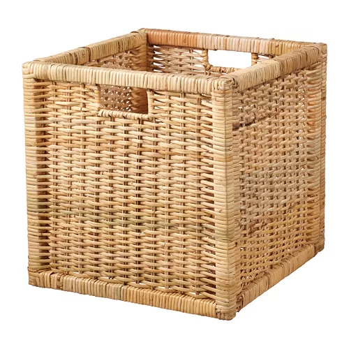
The BRANÄS basket is a handwoven rattan basket with a solid wood frame. Its color and texture can help introduce a natural element while also providing storage space for various small items.
The basket can be used with a KALLAX shelving unit or placed as part of an open storage area. In rooms dominated by beige, cream, or warm white, the rattan texture can provide contrast while maintaining a light appearance.
2. KOPPARBJÖRK vase for a soft brown accent
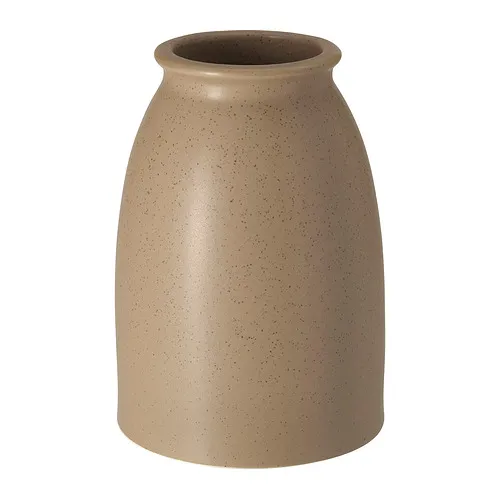
If you want to introduce earthy colors through small decorations, the KOPPARBJÖRK vase can be one option. This vase has a light brown color with a matte surface, making it easy to pair with beige, taupe, wood, or green.
Place it on a console table, dining table, or shelf alongside several elements of different heights. You do not always need to fill it with flowers because its shape and surface can already function as decorative elements.
3. PÅSKÖTRÄD vase for a transparent brown accent
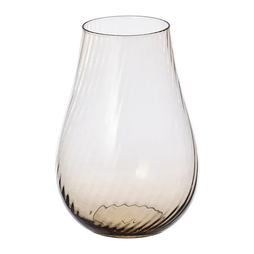
The PÅSKÖTRÄD vase uses light brown glass. Since the material is transparent, the color feels lighter than a solid brown decorative object.
Use this vase with branches, flowers, or as a decorative object on its own. It works well with beige, terracotta, cream, or wood brown palettes.
Create an earth tone interior with IKEA
Creating an earth-inspired interior does not mean that the entire room needs to turn brown. Start with one or two base colors, then add variety through furniture, textiles, lighting, and natural materials.
Pay attention to the conditions of your space as well. A color that works in a living room with large windows may not look the same in a small bedroom with limited light. Therefore, consider the size of the room, lighting, and existing furniture before deciding on the dominant color.
If you want to plan the overall colors, furniture, room layout, and lighting in greater detail, you can also use IKEA interior design services to discuss your space requirements with a designer.
Explore more room inspiration as well as other furniture and decoration options at IKEA.co.id to find elements that suit your home's palette.
FAQ about earth tone colors
Earth tones are a group of colors inspired by natural elements such as soil, sand, wood, stone, clay, and plants.
Some examples include beige, cream, tan, brown, taupe, olive, sage, terracotta, rust, and stone gray.
Sage can be used as part of an earth-inspired palette because it has a muted green character inspired by plants and can be easily combined with other natural colors.
Beige, cream, warm white, brown, olive, sage, terracotta, and gray can be combined with one another. Choose two to four colors to keep the composition easy to manage.
Yes. Use lighter colors such as beige, cream, or light taupe as the base, then add darker colors or terracotta in smaller amounts as accents.