Some bedroom colors remain popular because they are easy to adapt to various interior styles. If you are looking for safe yet comfortable options, these three colors can be a great starting point.
White as a flexible base
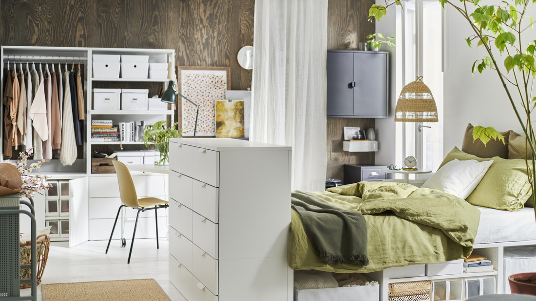
White is known as the most flexible color for bedrooms because it pairs easily with different decorative elements. You can combine it with soft textiles, wooden furniture, or bright accents as needed.
Besides making the space feel brighter, white also helps create a neat and organized look, making it suitable for bedrooms of various sizes and functions.
Beige or cream for a warm atmosphere
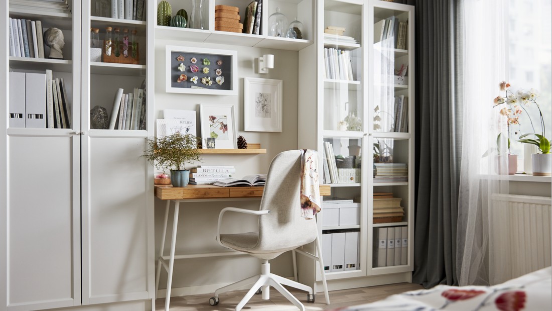
Beige or cream is a popular choice for those who want a warmer and more natural bedroom feel. This color gives a soft impression without making the room look monotonous, while also creating a comfortable environment for rest.
When paired with natural materials like wood or textured fabrics, the room feels more alive while still maintaining a calm ambiance.
Light blue for a calming effect
Light blue is often used to create a soothing atmosphere in the bedroom. This color helps promote relaxation, supporting better rest after a long day.
It also pairs well with white or grey for a clean and balanced look, ensuring the bedroom remains comfortable without feeling excessive.
Read also: Mezzanine bedroom design inspiration for more spacious minimalist homes
Recommended IKEA products that complement small room color choices
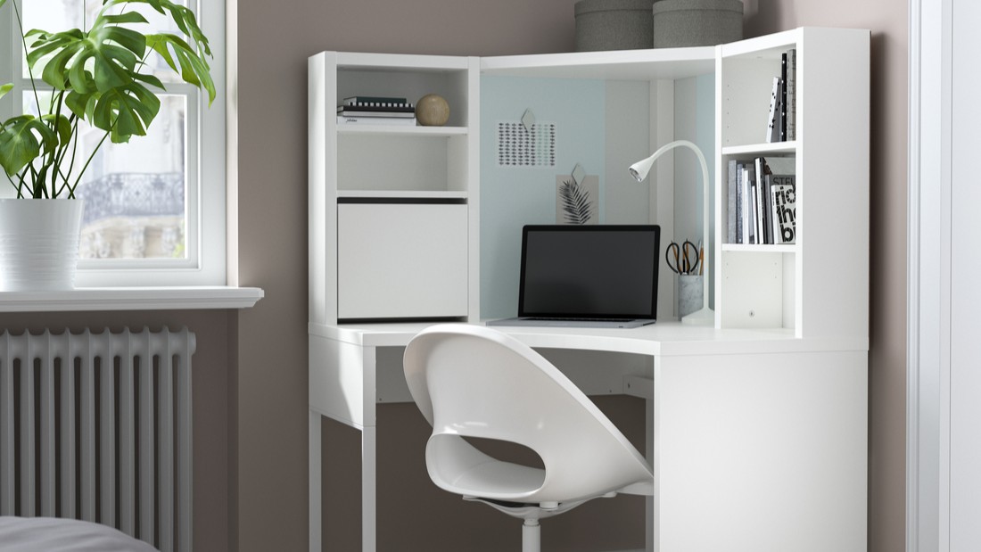
To support a room that feels more spacious, you can choose furniture with neutral colors and simple designs. A white MICKE desk, for example, helps create a clean look without adding visual weight to the space. Another option like white LAGKAPTEN/ALEX with two drawers unit offers a tidy work surface along with additional storage to keep the room organized.
The vissel dark blue ORFJALL swivel chair, with its lightweight design, complements the room without making it feel crowded. For children’s rooms, the LATT table or MAMMUT furniture with bright colors can be both playful and functional. With the right product combination, your chosen wall color can work more effectively in creating a comfortable and efficient space.
The meaning of colors in the home and their connection to comfort
Many people associate home paint colors with positive energy in daily life. While this is subjective, color choices can still help create a supportive and comfortable atmosphere at home.
Yellow and gold for a warm and optimistic feel
Yellow and gold are often associated with warmth, brightness, and energy. These colors can help bring a positive atmosphere into a space, especially in areas frequently used together.
You can apply them as accents to keep the balance without overwhelming the room, while maintaining long-term visual comfort.
Green as a symbol of balance
Green is inspired by nature and is often linked to balance and calmness. It is suitable for creating a fresh atmosphere and helping occupants feel more relaxed.
By adding natural elements such as plants or wooden furniture, the room becomes more lively while still supporting daily activities comfortably.
Blue for calmness and stability
Blue is known for its calming and stabilizing effect. Using it in bedrooms or resting areas can help create a more peaceful atmosphere after busy routines.
Combined with soft lighting and simple decorative elements, blue can create a tranquil space without reducing functionality.
Read also: Minimalist bunk bed design inspiration for your kids’ bedroom
A harmonious bedroom makes daily routines feel lighter